Friday, February 5, 2010

Promotional Posters


My writer, Tony, came up with the idea of drawing a bit of campus attention to our weekly strip as it's understandably quite easy to miss a 4x10" space in the middle section of a whole paper. What better way to do that than by plastering our material all over the walls of McMaster herself?


Tony originally imagined the first one featuring Captain Marauder on his own, but I thought it'd be nice to showcase the whole team (as they appear in these strips -- there are still 2 other members that don't). What's more, students get to see them depicted alongside their very own (stylized) campus landmarks. But perhaps best of all, at least for me, is to see our heroes in glorious colour. I have very minimal experience with colouring in Photoshop, and having taken a good chunk of time making the colouring just so, I realize there's no way I would have enough time to colour each strip to my liking. So I certainly appreciate the black and white format of the weeklies... but my, how cathartic it is to finally take the time to give these characters the full-colour treatment they've been yearning for. I wanted to go for an epic, almost 1920s-style vibe. Did I pull it off? Well it is epic -- the swooping perspective, towering buildings and larger-than-life figures ensure that. I also quite like the slogan at the bottom, recycled from our very first teaser advertisement in the paper. I suppose that's a fitting way to start off the next round of ads...

The second poster was fun to do; drawing big baddies is always a joy. And who doesn't love to vilify Engineers? I was toying with the idea of having him bursting forth from the first poster. While that would have been rather cheeky, it ended up just looking busy and confusing. I found putting faded past strips as the poster background would give people an idea of what the strips themselves look like, and also represent the excitement of characters tearing out of the page and confronting the reader... I dunno, kind of a lively and appropriate symbol there. He who has ears, let him hear. I struggled making MechEng look as clean and distinguishable as the heroes. I guess it's due in part to my choice of posture (with an ambiguous silhouette), but in the end I think that works for the character. He's gritty and mechanical and bulky. Lest they be confused, I drew subtle attention to the machine itself as it appears in the comic in the upper left, just so the viewer has another point of reference for what he looks like. And there you have it folks... a display for one and all of both heroism and dynamics. He who has eyes, let him see.

"Invasion of The Malice Circus!" 4/6 ("Masks Off" #2)


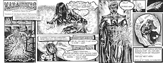
Ooooh, the mystery continues. In "Masks Off" tradition, there's more dialogue in this strip, with a focus on the Professor (the team's sage mentor) and it's really only valuable (or comprehensible) to those who have followed along the story to this point, bringing together aspects from the “MechEng” arch and the present “Invasion” storyline. It's important in advancing the plot, and I think it's equally important to reward the reader for their attention.

When there's no action going on I find it difficult to design a logically flowing layout, and this strip took me some time to figure out how to deal with the script. I stuck to comic reading convention, and tried a couple of tricks to help indicate where the eye ought to go. Even if some folk do find which panel to go to next slightly ambiguous, it's no surprise -- the dialogue is mostly one-sided and thus more is left up to the reader, and also the reader isn't meant to understand exactly what the characters are talking about in the first place. It all makes sense in the grand scheme of things, but for now we don't really know what's going on. Sulla (the senior member of the team) has one leg up on us, with the ability to -- woops. Shouldn't say yet. That must be irritating. Anyway, even if for some reason the intrigue doesn't tickle your fancy as much as POW-action, hopefully the art still does.

Fun Fact: Mills Library is ALWAYS busy and noisy.

Thursday, January 28, 2010

"Invasion of The Malice Circus!" 3/6


What's this? More new characters? You betcha. And -- not to give anything away -- we've now revealed the full extent of the Marauders team at this point. There were two other characters we originally designed to be involved but they would make the story needlessly busy. Divinus is my favourite member of the team. He's the spiritual powers guy, coming onto the scene this time as the "Ghostbuster." I think La Spectra (as she is called) turned out nice and creepy, and I'm strangely proud of how well the whooshing bottle came out in the top right.

Once again the strip printed a bit darker on the newsprint than I meant it to... but I think it at least works this time around seeing as it's supposed to take place in the dark, and Divinus is supposed to be ethnic. You'll notice I've also tried playing around with some SPECIAL EFFECTS-ECTS-ECts-ects-cts-cs dealing with light sources (ie. flashlight and glowing hands). Exciting stuff.

Fun Fact: Twelve-Eighty is the on-campus restaurant and bar, formerly called Quarters. Alot of people didn't like the changes made, but it seems to be winning others over.

Thursday, January 21, 2010

"Invasion of The Malice Circus!" 2/6


New characters introduced! Lady Maroon and Maroon Mind, or "The Mystic Twins," were some of my favourite characters to develop and it was fun to finally get to draw them. Captain Marauder is the most iconic, but also the most bland to illustrate. Branching out into female form is also a welcome challenge for me.

I tried to ease back on the intense inks this week. I think I might have got it right this time, firstly reducing the contrast of the overall strip (since it always prints darker on newsprint), and using less shadow in general. It seems to make for a less stifling appearance. I'm also really happy with my paneling at this point. I'm getting very used to working with the format so it's coming much more naturally now, I can start experimenting here and there whilst keeping it nice and tight. I made a couple of revisions to some of the drawings, particularly to Maroon Mind's face and legs in the last panel, which I've shown here. A bit too late though, since it had already gone to print by the time I tweaked it. But there are myriad alterations I want to make on all 5 previous strips so far as well... so I can't complain.

Tuesday, January 12, 2010

"Invasion of The Malice Circus!" 1/6


Well, it's been about a month since the last issue of The Magnificent Marauders in the paper due to the Christmas break. But we're back up and running with a new storyline (building on "MechEng Online!"). I had to stay up till 9am last night/this morning in order to make the deadline, but I'm still quite happy with the final product, despite my sore drawing hand and delirium.

With the advent of some new drawing pens, I've noticed my inks seem to be getting progressively darker compared to my earlier drawings when I had to hatch everything with a fine pen. I'm not sure which one is more effective. Perhaps I'll meet somewhere in between. I've also started lettering using a typeface called Lafayette Comic Pro instead of doing it by hand. This saves time, space, makes it more tidy and professional. I've gone back and re-lettered strips 1-4, which I might put up sometime in the future.

Fun Fact: La Piazza is cafeteria in the Student Center. The food prices in there give me about the same reaction as in panel 4-6.

Monday, January 11, 2010

The Magnificent Marauders!


If you want to check out the student comic that I illustrate, check out the facebook group:
http://www.facebook.com/group.php?v=wall&gid=180796256339

Or we just got our own backslash on The Silhouette website, so you can look at our blog there:
thesil.ca/marauders

I'd love to hear what you think. Even though nobody is reading this anyway, so "you" is really "I." Oh well, talking to myself makes for good conversation. Like right now. I've spent 3 sentences on the matter, and now a 4th. Boy, what self-reflexive writing this is. Meta-blogging.

That's enough of that.


Monday, January 4, 2010

Some Comissions


I've done a couple of projects for other people over the past few years. Most of those requests are the ever-vexing tattoo designs for friends. I came across these three on my computer recently so I thought I'd slap 'em up on here.


I did this crest design for my graduating year at I.E.Weldon Secondary School. We were the wonderfully cliched "Wildcats."


Last year I founded a comic society at the University of Leeds on my year abroad ("The Leeds of Extraordinary Gentlemen" as we called ourselves). These were some logo concepts I concocted. We went in another direction in the end, but I recycled the LEG Man in some Magnificent Marauders promos for the paper this year.


I've done a few designs for the Outdoors Society at my university, this poster I never ended up seeing actually posted anywhere, however.