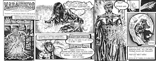
Sunday, October 31, 2010

Gourmet Burger Kitchen Comission


My friend Lora works for GBK and gave me lots of delicious burger vouchers for doing this for their staff party. It's adapted from the second issue cover of Marvel's "Strange Tales," which I adore... I'm a sucker for a spindly Spidey. Bit o' fun, bit o' food.

The Magnificent Marauders Season II

Well, turns out this year I had the pleasure of continuing my involvement with the McMaster student paper comic strip for the first story arch, all the way from England. I'm looking forward to see what things will look like when the pen and paper gets handed over to the other two artists. It was nice to reprise my role as artist, and it's good to finally have the project finished and under my belt now. Here they all are...


Monday, August 16, 2010

Blaze Bear

Here are some quick storyboard concepts I did this summer with West Park Media for a Yorkshire fire department ad. Blaze Bear is the English fire safety mascot, much like Smokey Bear, and I thoroughly enjoy the idea of him bursting into private situations to "save the day" by soaking things. I'll put up the link to the video once production is finished and whether or not they put it online.


Sunday, April 4, 2010

"March of Death!" 4/4 Finale


Well, 14 strips later and here we are... a full year's worth of little comic strips. I utilized last week's "March of Death" banner because I thought it worked really well, and embellished the title card to reflect the pulp adventure serials I was loosely trying to emulate. Everything is wrapped up in this one, and I think it's a great way to end of the series, since I myself will be graduating in a month. I brought in the array of heroes from one of my very first mock ups of the team I did for Tony back in 2008 -- ending as we began, in a way.

Next steps will include publishing the collected strips (either doing it semi-professionally, or just printing them off myself and stapling them, zine style) along with some sketches and additional material. It'd also be great to have students next year take up the mantle of The Marauders to keep them going for future generations of McMaster students to explore further. But, even if it ends here, it was incredibly rewarding for me to work on my first published comic this year. The perfect diversion from school work (too often, at times), I think it will ironically represent more about my future as a body of portfolio work than my history degree, demonstrating my ability to (somewhat hastily) get things in on a weekly basis. At least that's more than I could say about research papers.

I hope anybody who actually read it enjoyed it, I know I did. Now it's on to other projects! I've got a few ideas in the works, so stay tuned...

Saturday, April 3, 2010

"March of Death!" 3/4 Special Edition


Full page o' glory! The newspaper printed a special music edition magazine in the paper last week which absorbed most of the content. As a result, we got a space three times as big as we usually do for the Marauders strip. It came at the perfect time in the story as well, right when the action is the most... action-packed. This was so much fun to do, and also so much work. I had to seriously rush a few of the panels as a result of basically doing three weeks worth of drawing in one week, and it was challenging to figure out the new layout. I think the serious hand crampage payed off though... it's certainly a nice highlight piece to the whole series, and a great opportunity to work on a larger scale.

I loved the way Divinus' teleportation scene worked out, as well as the final panel. They are some of my favorites from the whole series. I also enjoyed how reflective this was as a metaphor for my coinciding school life. March truly is a time of death, and I felt just like our heroes, unable to keep up with the horde of assignments pressing in on me from all sides. Will I get them all done? We'll just have to wait and see if our heroes survive...

Thursday, March 25, 2010

"March of Death!" 2/4


We finally get to figure out what's going on in this issue, with some hinted back-story. Which is great. Not to mention the important fact that I got to draw zombies. A zombie, I suppose (though he does break the "no talking" rule of zombies... though I suppose the fact that he's possessed accounts for that) . The Cap is also back from his hiatus -- off catching up with homework after his encounter with MechEng way back when -- along with Dr.Pine and Sulla. This strip only has 4 panels as well, alot less than the usual 6 or 7. It gives it more space for detail, giving me the chance to really lay on the ink. I think it turned out nicely. Like last week's re-use of Togo Salmon, the keen eye will detect that I used Captain Marauder's pose here for my poster design as well.

Fun Fact: Dr. Togo Salmon made his living researching the Italian Samnite people. Perhaps he read the wrong ancient scroll at some point... with dire consequences! But hey, I just draw this stuff.

Tuesday, March 16, 2010

"March of Death!" 1/4


Each has brought us closer to the reveal of the main villain: Zombie Togo Salmon! This week he's finally here. I stuck with pretty straightforward panel design. I do like some of the images (Divinus' cape is a favorite, based on Batman style cool), but overall I think the strip is kind of mediocre compared to others so far. I recycled the zombie image from one of the very first promotional ads in the paper at the start of the year, I just made it bigger and added more detail. Cheating? On the contrary. I think it's fun to add in specific images that have been used elsewhere. That's the point of an ad isn't it? To show what you're going to see. Anyway, something strange I didn't intend is Lady Maroon (on her cellphone, as usual) ended up looking like Megan Fox. Which is fine.

Sunday, February 28, 2010

"Invasion of The Malice Circus" 6/6


This might be my favorite strip yet. Closing off the end of this arc, the action is the best so far and I got to spend alot of time fiddling around with sketches over reading week in Florida, giving me the chance to do some more detail and think about layout some more (although I've recently been told it might make it look too busy). I had the most fun with Kinessaurus, who is becoming somewhat of a favorite, and really nail down his appearance. He's taken an interesting evolution since his first appearance, just subtly evolving more distinctly bad-aced features. The original panels are each much bigger, so it's a bit of a shame I had to shrink them down... but I knew that when I was drawing them. As a result of the scale, the lines are much thinner than usual as well, which I think ends up working quite well in terms of the ink intensity I've been trying to balance.

I originally intended to have Lady Marron as the 3rd panel, but I'll let you use your imagination to project where Kinessaurus' slathering tongue would be curling around due to the overlap... Suffice to say I decided to keep it a family comic and swap her with Maroon Mind.

Saturday, February 27, 2010

Early Updates


As promised, here are the revisions to the first 4 strips I've done since I started using the comic lettering instead of hand writing them. I've also gone back and adjusted the layout to look more like my more recent ones, applying what I've learned. And some additional greyscale shading is thrown in here and there to freshen it up. Eventually I'm going to change the Marauders logo to the updated version you see on "MechEng Online!" pt.1. Compare these to the older versions to try and spot the differences... nothing major, just enough to make them look more natural.

I go back and tweak just about every strip after I see it printed, so some day I'll throw up all of the final drafts for those as well (most likely at the end of the semester once the series is complete).

"Invasion of the Malice Circus!" 5/6


More La Spectra! This was the strip which ran just before reading week, which was a few weeks ago now... I'm a bit behind with posting, seeing as I've already finished this week's as well. I'm trying to get my bearings in terms of darkness in this strip, since it takes place with the lights off. Instead of making everything look really dim, I just went with a high contrast approach. I think it works alright. Divinus is my favorite hero so it was fun drawing him in action, but we're pretty limited in terms of how much we're able to explain characters' powers... so while Divinus has a host of cool spiritual abilities, I pretty much just stick with your generic hand blasts to keep it simple.

Fun Fact: Togo Salmon was a professor and History Chair at McMaster for over 40 years. One of "The Four Horsemen Halls" (Togo Salmon Hall) was thusly named after him.

Thursday, February 25, 2010

Blankets


Over Christmas I bought this fantastic book. I devoured it in two days and read my favorite portions over again. When the student paper was coming out with a special Break-Up Issue for Valentine's Day, Blankets immediately sprung to my mind. This is the "heartbreak" angle I used for my review:

If you have ever lost something precious, you’ll know the heartache that comes along with it. But, as Pulitzer Prize-winner Jules Feiffer has said, “that which goes awry in life, goes well as art.” Craig Thompson’s illustrated memoir Blankets illuminates that sentiment, with 582 black-and-white pages dripping with moody emotion. The inky art of Blankets is rich with quilt-like motifs which he cleverly overlays with his dialogue and narration to generate poignant metaphors.


Spanning 9 thematic chapters, the central story recalls the isolation of Thompson’s religious childhood and youth through the lens of his time spent under blankets, be it sharing a bed with his younger brother or innocently spending the night with his first-love. Subtly woven throughout the plot are Thompson’s musings on how adolescent romantic relationship serves as an analogy for his spiritual relationship with God… or is it the other way around? Through these reminiscences, the “nakedness” that comes with intimacy is exposed, along with the loneliness that comes in its absence, with nothing to cover your shame but blankets.


While the tenderness with which the story is told might seem soppy, Thompson’s self-pitying is told with such honesty that it could wring out sympathy from even the most cynical reader. In fact, what makes Blankets so impressive is not just Thompson’s mastery of the medium, but also in his ability to tell such a lengthy, hyper-personal story while still keeping it universal. The story reveals how a passion can burn so hot that it devours itself. Which is not to say that the passion was not a genuine one, only that it shifts, wanes, vanishes. Love, like this life, is an intrinsic source of meaning and joy, but it doesn’t have to last forever. And not only is that okay, it’s what makes it beautiful. It's in ways like this that the story makes constant allusions to Ecclesiastes, my favorite biblical book (most of the epilogue is just Thompson's own illustrations and contemplations on it, and how it aided him along his spiritual sojourn). Instead of despairing over the meaninglessness of a love lost, Craig feels blessed that he was able to experience it in the first place.

In the end, Craig finds the relief and personal reprieve that comes from letting go. Purging himself of sin, of obsession, he is free to rest in the comfort that someone else has shared in his experience. Blankets’ epilogue ends with Craig trudging through a winter forest, his footsteps filling in with fresh snowfall as he moves forward: “How satisfying it is to leave a mark… no matter how temporary.” Boy, and all that in a silly comic?

Friday, February 5, 2010

Promotional Posters


My writer, Tony, came up with the idea of drawing a bit of campus attention to our weekly strip as it's understandably quite easy to miss a 4x10" space in the middle section of a whole paper. What better way to do that than by plastering our material all over the walls of McMaster herself?


Tony originally imagined the first one featuring Captain Marauder on his own, but I thought it'd be nice to showcase the whole team (as they appear in these strips -- there are still 2 other members that don't). What's more, students get to see them depicted alongside their very own (stylized) campus landmarks. But perhaps best of all, at least for me, is to see our heroes in glorious colour. I have very minimal experience with colouring in Photoshop, and having taken a good chunk of time making the colouring just so, I realize there's no way I would have enough time to colour each strip to my liking. So I certainly appreciate the black and white format of the weeklies... but my, how cathartic it is to finally take the time to give these characters the full-colour treatment they've been yearning for. I wanted to go for an epic, almost 1920s-style vibe. Did I pull it off? Well it is epic -- the swooping perspective, towering buildings and larger-than-life figures ensure that. I also quite like the slogan at the bottom, recycled from our very first teaser advertisement in the paper. I suppose that's a fitting way to start off the next round of ads...

The second poster was fun to do; drawing big baddies is always a joy. And who doesn't love to vilify Engineers? I was toying with the idea of having him bursting forth from the first poster. While that would have been rather cheeky, it ended up just looking busy and confusing. I found putting faded past strips as the poster background would give people an idea of what the strips themselves look like, and also represent the excitement of characters tearing out of the page and confronting the reader... I dunno, kind of a lively and appropriate symbol there. He who has ears, let him hear. I struggled making MechEng look as clean and distinguishable as the heroes. I guess it's due in part to my choice of posture (with an ambiguous silhouette), but in the end I think that works for the character. He's gritty and mechanical and bulky. Lest they be confused, I drew subtle attention to the machine itself as it appears in the comic in the upper left, just so the viewer has another point of reference for what he looks like. And there you have it folks... a display for one and all of both heroism and dynamics. He who has eyes, let him see.

"Invasion of The Malice Circus!" 4/6 ("Masks Off" #2)


Ooooh, the mystery continues. In "Masks Off" tradition, there's more dialogue in this strip, with a focus on the Professor (the team's sage mentor) and it's really only valuable (or comprehensible) to those who have followed along the story to this point, bringing together aspects from the “MechEng” arch and the present “Invasion” storyline. It's important in advancing the plot, and I think it's equally important to reward the reader for their attention.

When there's no action going on I find it difficult to design a logically flowing layout, and this strip took me some time to figure out how to deal with the script. I stuck to comic reading convention, and tried a couple of tricks to help indicate where the eye ought to go. Even if some folk do find which panel to go to next slightly ambiguous, it's no surprise -- the dialogue is mostly one-sided and thus more is left up to the reader, and also the reader isn't meant to understand exactly what the characters are talking about in the first place. It all makes sense in the grand scheme of things, but for now we don't really know what's going on. Sulla (the senior member of the team) has one leg up on us, with the ability to -- woops. Shouldn't say yet. That must be irritating. Anyway, even if for some reason the intrigue doesn't tickle your fancy as much as POW-action, hopefully the art still does.

Fun Fact: Mills Library is ALWAYS busy and noisy.


Thursday, January 28, 2010

"Invasion of The Malice Circus!" 3/6


What's this? More new characters? You betcha. And -- not to give anything away -- we've now revealed the full extent of the Marauders team at this point. There were two other characters we originally designed to be involved but they would make the story needlessly busy. Divinus is my favourite member of the team. He's the spiritual powers guy, coming onto the scene this time as the "Ghostbuster." I think La Spectra (as she is called) turned out nice and creepy, and I'm strangely proud of how well the whooshing bottle came out in the top right.

Once again the strip printed a bit darker on the newsprint than I meant it to... but I think it at least works this time around seeing as it's supposed to take place in the dark, and Divinus is supposed to be ethnic. You'll notice I've also tried playing around with some SPECIAL EFFECTS-ECTS-ECts-ects-cts-cs dealing with light sources (ie. flashlight and glowing hands). Exciting stuff.

Fun Fact: Twelve-Eighty is the on-campus restaurant and bar, formerly called Quarters. Alot of people didn't like the changes made, but it seems to be winning others over.

Thursday, January 21, 2010

"Invasion of The Malice Circus!" 2/6


New characters introduced! Lady Maroon and Maroon Mind, or "The Mystic Twins," were some of my favourite characters to develop and it was fun to finally get to draw them. Captain Marauder is the most iconic, but also the most bland to illustrate. Branching out into female form is also a welcome challenge for me.

I tried to ease back on the intense inks this week. I think I might have got it right this time, firstly reducing the contrast of the overall strip (since it always prints darker on newsprint), and using less shadow in general. It seems to make for a less stifling appearance. I'm also really happy with my paneling at this point. I'm getting very used to working with the format so it's coming much more naturally now, I can start experimenting here and there whilst keeping it nice and tight. I made a couple of revisions to some of the drawings, particularly to Maroon Mind's face and legs in the last panel, which I've shown here. A bit too late though, since it had already gone to print by the time I tweaked it. But there are myriad alterations I want to make on all 5 previous strips so far as well... so I can't complain.

Tuesday, January 12, 2010

"Invasion of The Malice Circus!" 1/6


Well, it's been about a month since the last issue of The Magnificent Marauders in the paper due to the Christmas break. But we're back up and running with a new storyline (building on "MechEng Online!"). I had to stay up till 9am last night/this morning in order to make the deadline, but I'm still quite happy with the final product, despite my sore drawing hand and delirium.

With the advent of some new drawing pens, I've noticed my inks seem to be getting progressively darker compared to my earlier drawings when I had to hatch everything with a fine pen. I'm not sure which one is more effective. Perhaps I'll meet somewhere in between. I've also started lettering using a typeface called Lafayette Comic Pro instead of doing it by hand. This saves time, space, makes it more tidy and professional. I've gone back and re-lettered strips 1-4, which I might put up sometime in the future.

Fun Fact: La Piazza is cafeteria in the Student Center. The food prices in there give me about the same reaction as in panel 4-6.

Monday, January 11, 2010

The Magnificent Marauders!


If you want to check out the student comic that I illustrate, check out the facebook group:
http://www.facebook.com/group.php?v=wall&gid=180796256339

Or we just got our own backslash on The Silhouette website, so you can look at our blog there:
thesil.ca/marauders

I'd love to hear what you think. Even though nobody is reading this anyway, so "you" is really "I." Oh well, talking to myself makes for good conversation. Like right now. I've spent 3 sentences on the matter, and now a 4th. Boy, what self-reflexive writing this is. Meta-blogging.

That's enough of that.


Monday, January 4, 2010

Some Comissions


I've done a couple of projects for other people over the past few years. Most of those requests are the ever-vexing tattoo designs for friends. I came across these three on my computer recently so I thought I'd slap 'em up on here.


I did this crest design for my graduating year at I.E.Weldon Secondary School. We were the wonderfully cliched "Wildcats."


Last year I founded a comic society at the University of Leeds on my year abroad ("The Leeds of Extraordinary Gentlemen" as we called ourselves). These were some logo concepts I concocted. We went in another direction in the end, but I recycled the LEG Man in some Magnificent Marauders promos for the paper this year.


I've done a few designs for the Outdoors Society at my university, this poster I never ended up seeing actually posted anywhere, however.